Project Outline
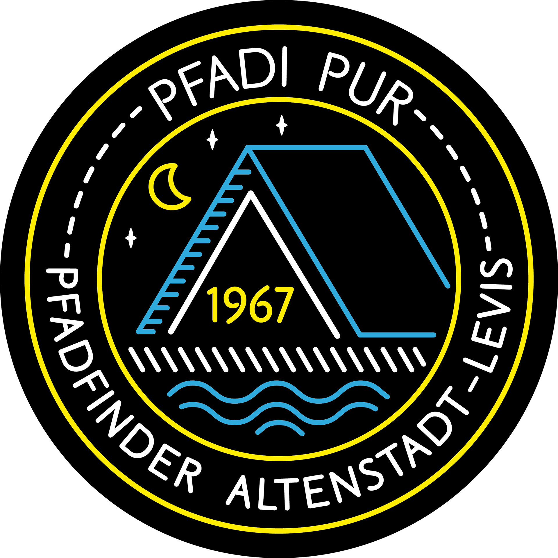
The task was to design a logo on black background that uses the same colors as the group's original logo – yellow and blue. This was due to the fact that the logo was supposed to be printed on black t-shirts, which were already in stock.
During the process, another variation of the logo was created for the use in magazines, ads and official correspondence. To give the logo a softer and friendlier touch, the background color was changed to blue.


Design Concept
The anniversary logo was designed to fit to the scout group's original logo, which also merely consists of outlines.The color scheme and illustration style was already given by the design of their black group t-shirts.
Since the motto was "pure scouting", I focused on what scouting is most known for – which is sleeping in a tent. The waves further symbolize the river "Nafla" – which is situated right in front of their home base in Altenstadt, Austria. The blue fabric used as background for the flyer is another reference to the patches scouts usually attach to their uniform.
The logo design later has been transferred to the design of flyers, wristbands and pennants.
