Concept
REDIDTECH is a down-to-earth company operating in three different business fields. Thoughtful considerations and elaborations – in close collaboration with my client – resulted in a geometric, edgy and bold logo that combines a distinct picture mark with a clear and modern-looking letter mark.
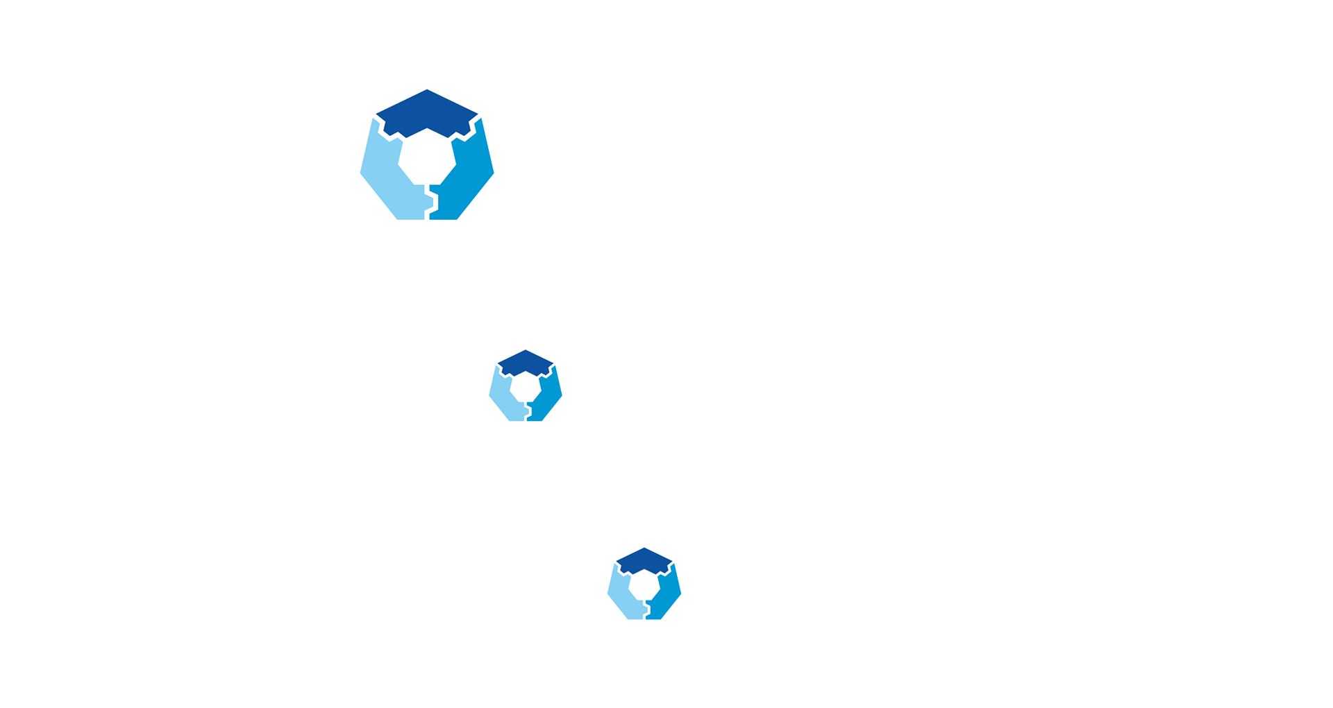
The picture mark consists of three shapes that reflect the three business fields that REDIDTECH operates in: maintenance, special engineering (machine construction) and safety engineering. Each one of those business fields has its own designated color. The three parts are connected and toothed like a gear wheel. It's geometric shape and sharp edges suggest precision and accuracy.
The picture mark consists of three shapes that reflect the three business fields that REDIDTECH operates in: maintenance, special engineering (machine construction) and safety engineering. Each one of those business fields has its own designated color. The three parts are connected and toothed like a gear wheel. It's geometric shape and sharp edges suggest precision and accuracy.
Logo
Typography
Colors
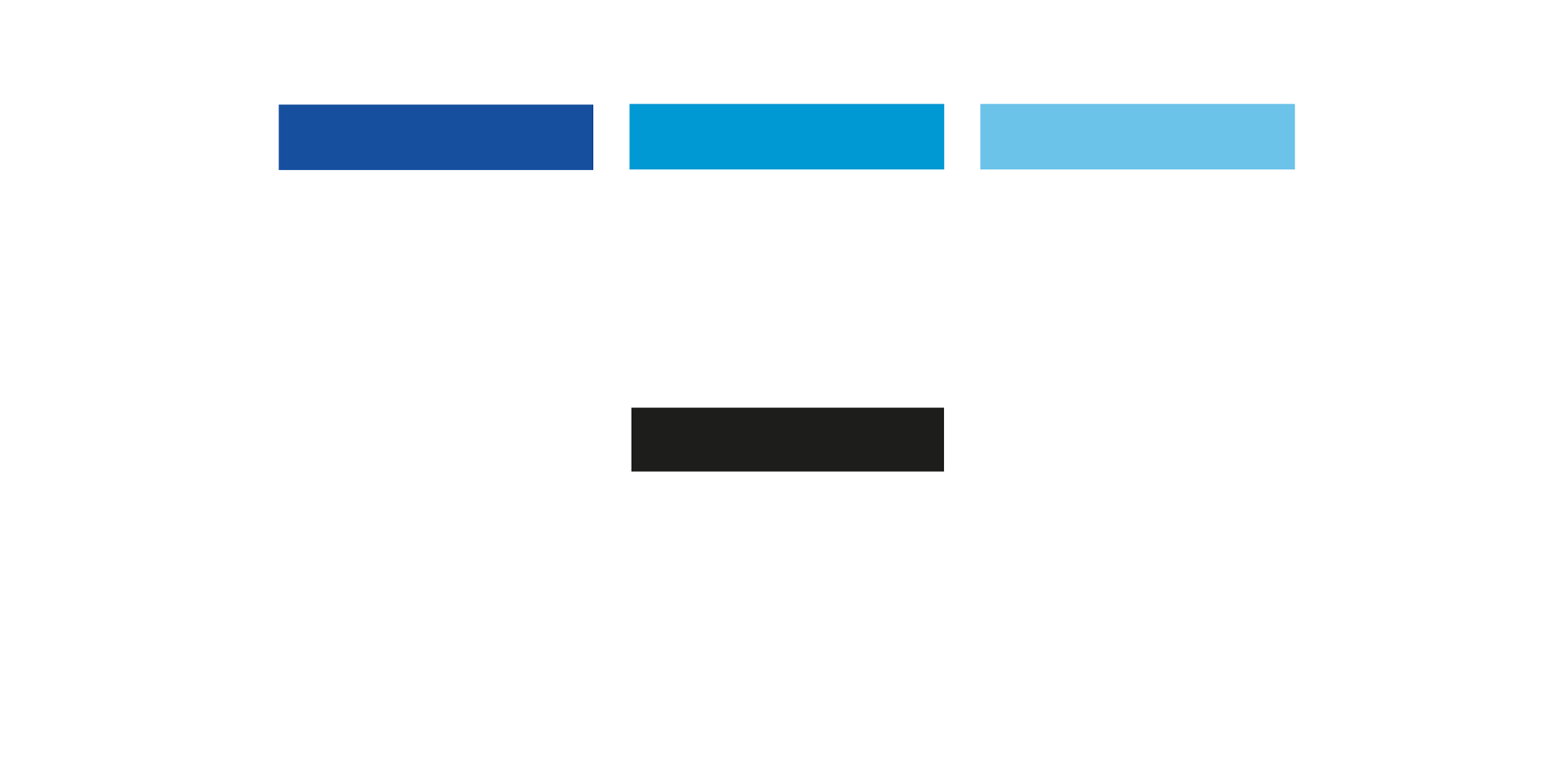
Blue was chosen as the main color because it's proven to establish an emotional connection and build trust. Blue further symbolizes clarity, objectivity and security – values, that are very important to REDIDTECH. A perfect match!